Want to know more?
Are you interested in this project? Or do you have one just like it? Get in touch. We’d love to tell you more about it.
The provision of service design solutions is a key aspect of how Equal Experts supports customers to grow their business. When the team at John Lewis & Partners wanted to improve their end-to-end customer experience for sofa purchases, the starting point was a focused discovery process to determine exactly how customers were interacting with staff and products in-store as well as online.
This included experiences in-store and on the johnlewis.com website, right through to the final stages of the process – delivery and fitting. This would determine what design changes were needed to improve revenue and customer satisfaction for the Partnership.
Equal Experts consultants worked alongside John Lewis & Partners staff as a team to
Research suggests that if customers don’t find something they like within 30 seconds, they leave the website and go elsewhere. We needed to ensure that the landing page would instantly tell the customer that they were in the right place. The new service design simplified visuals and made it as easy as possible for customers to navigate and filter down to the perfect sofa.
revenue from upholstery orders
increase in customers navigating to a product page
increase in fabric option views
The John Lewis Partnership owns one of the UK’s oldest, largest and most popular retailers. The John Lewis brand has been synonymous with value and trust for over 100 years. Today it is the largest employee-owned business in the UK, with 80,000 Partners (employees) and 41 stores globally.
User experience (UX) design focuses on the online interaction a person has when researching or completing a task. The focus in this case was on the upholstery pages at johnlewis.com across multiple channels, including the web, app, or at a kiosk in-store.
What we found in Discovery was that the features customers told us were a priority (e.g. colour, size and shape) didn’t jump straight out at them. As with most websites, the customer simply saw a list of sofas, which didn’t give them enough detail to buy with confidence. This meant a high drop-off rate as potential customers browsed the website, but couldn’t easily find the answers they were looking for.
Another opportunity was being missed too: John Lewis & Partners’ sofas are made to an incredibly high standard, but there wasn’t a way to easily showcase that quality on the website. For example, their Any Shape, Any Fabric (ASAF) promise means that any of their 130 fabric options can be used on any product, from a single armchair or a two seater sofa, to a 3 or 4-seater corner sofa. This is a strong part of the offer, but there was a lot of work for the customer to do before understanding the options available to them and seeing the final price.
Our research process found that other sofa retailers tend to have a more ‘what you see is what you get’ approach to their furniture options and pricing, where it’s much easier to see a ballpark cost per item. Effectively John Lewis & Partners have a lot more flexibility, quality and choice in their offer, but they weren’t making it easy for the customer to see that, and narrow down their options to make a good decision. This was a missed revenue opportunity.
The service design approach involves taking a step back, to observe how customers are engaging with the existing shopping experience to understand the brand and find what they need. The team wanted to know how we could improve the journey of a customer buying a new sofa or chair.
To achieve this, a service design consultant ran a Discovery to identify what customers believe are the most important criteria when choosing a new sofa. We looked at the end-to-end journey and pulled out problem statements within that journey.
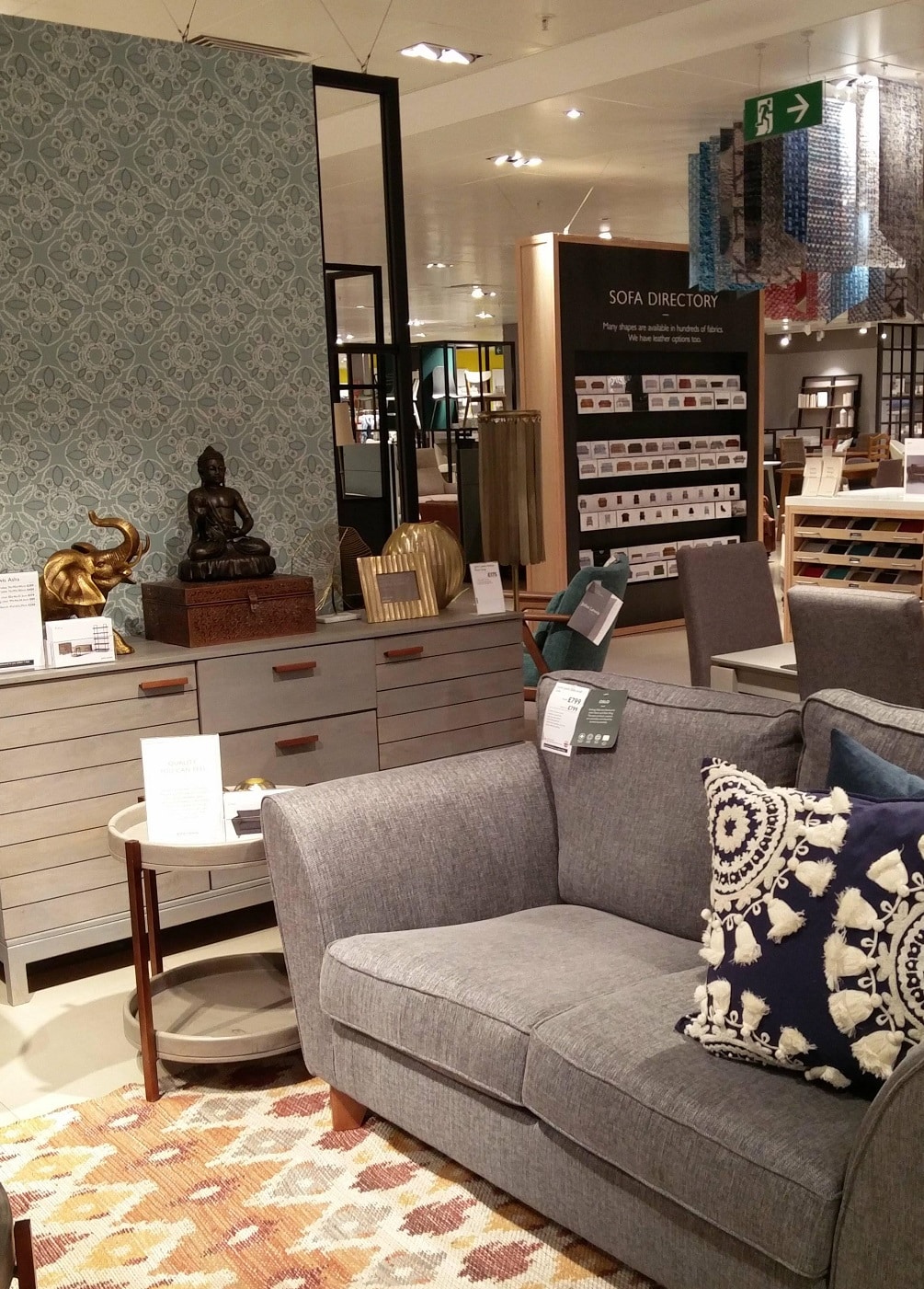
As well as surveys, the team conducted store visits (both within John Lewis and at competitor stores) and observed that there is a large amount of human interaction involved in selling a sofa well. Our online service design solution would need to take into account:
The in-store research also led us to group customers’ selection criteria into two factors:
Customers told us that their immediate concerns when choosing a sofa were fabric, colour, size and shape. In addition to these, visible transparency around price was deemed important, because of the values associated with John Lewis & Partners, namely honesty and integrity. These factors needed to be immediately identifiable.
We also found that the customers’ intended use for the product was crucially important but the available filters made it hard to shortlist for their own scenarios. This made the product inventory incredibly complex to navigate. These are the three most likely scenarios:
Next, the team analysed the johnlewis.com website performance to understand which pages were converting well, which weren’t, and where customers tended to dwell versus where in the process they might drop off and leave. We measured customer satisfaction responses at every stage to determine the most common pain points.
Having deep customer insight from the discovery really informed our decision processes in the design and functionality of the new product page.
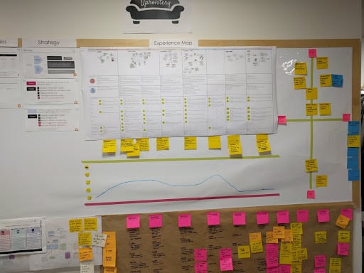
From all the customer responses, gathered from diverse and multiple sources, we determined a list of over 100 problems to address, from which we prioritised the most important pain points to solve. These were the issues that represented the biggest opportunities for John Lewis & Partners to increase revenue, minimise dropoff, and deliver a great user experience. The service design consultant worked closely with members of the internal design teams – the people who actually design, build and market the product for John Lewis. This cross-functional collaborative approach helped the team to create the best solutions for the whole business.
But how do you reflect the in-store customer journey in the online experience? In store, the space is designed around the needs of the customer. Instead of reinventing the online process, we tried to mimic that customer journey by creating a sofa user experience map made up of wants and needs at each step. We wanted to achieve an easy shopping experience, from the customer’s armchair at home, whereby they could clearly understand how to choose and customise their sofa, and know exactly what to expect at the delivery point.
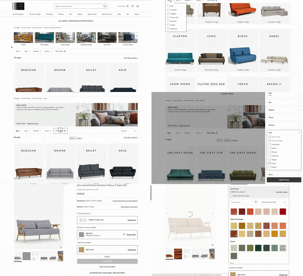
We extracted product data from centralised systems, then manipulated it to help the customer navigate products by colour, range, size and style. This allowed us to carefully steer the customer journey, shaping how customers discover attributes to arrive at the perfect sofa for them.
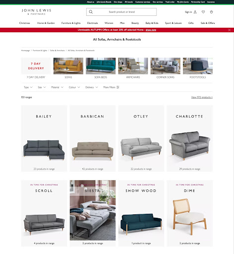
The team wanted customers to be able to see all their options and match them to the specific need they have for that product purchase. We took a beta approach, to quickly learn how customers were using the PLP, allowing us to improve the shortlisting features and enable customers to identify options and suggestions, and narrow their search more effectively. Where previously, sofas had been grouped by style and collections (which our research told us were quite subjective), we now incorporated these as filters within a more streamlined listings page, for those customers who wanted to research deeper. The new PLP showcased every sofa in a simple and more visual way, so that customers could immediately identify and engage with products that appealed to them, without needing a detailed understanding of design style.
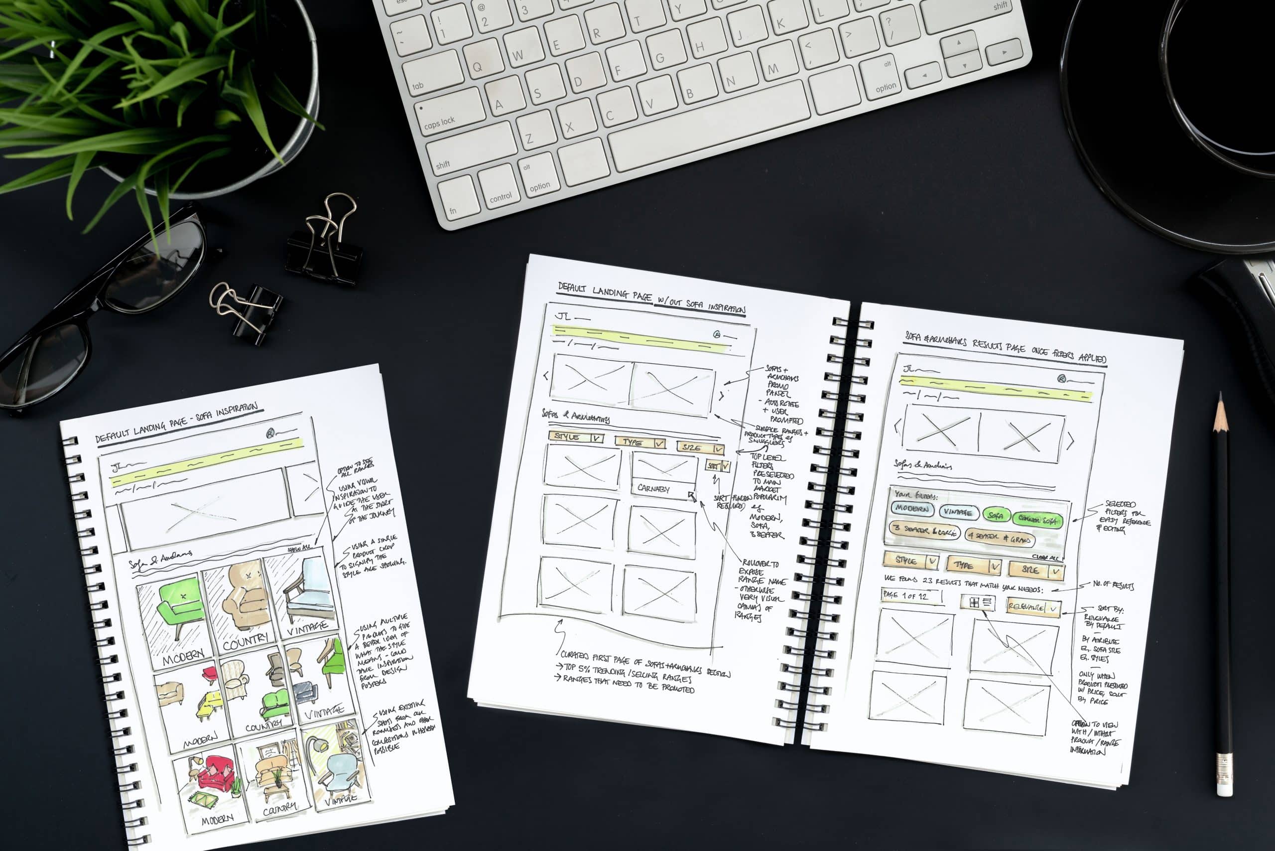
Throughout the process we ran focus groups with customers, gauging responses as they navigated the existing johnlewis.com website, and the new prototype site, alongside competitor sites.
The cross-functional design service executed with John Lewis & Partners has led to a much less complicated online experience for customers, resulting in an increased average order value and lower drop-off rates. Instead of a basic list-style landing page, customers now see simple product card listings showing an image of the sofa style; hovering over the card shows the sofa in an example room, so the customer can more easily visualise it in their own space.
There’s also a clearly visible section for the “Sofas in 7 Days” range which customers have historically seen as potentially inferior in quality, or as overstock items. In fact, these sofas are made to the exact same quality as the Any Shape, Any Fabric sofas, but are produced in the most popular shapes and fabrics in response to trend forecasting; this is made possible through quality design research. The new PLP makes this clear, giving customers another compelling reason to buy.
Sizing was identified over and over again as an important factor, so as well as showing the sizes of each sofa option, our service design team included a cell where customers could enter their own dimensions of their space, and use that as a filter to see only the variations that would fit.
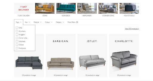
It’s also now possible to filter by product type, which is another way of reducing frustration for the customer when searching for a specific need. For example, if the customer knows they want a sofa bed, it’s a straightforward initial selection to be shown only the sofa beds, getting straight to the relevant products for each customer.
Customers at John Lewis & Partners are now able to see very quickly which sofa styles resonate with them, how many sofas there are within the range, the prices, colour options and delivery timescale. The added filtering options provide more specific details for customers who need them, and make the new PLP much more functional and navigable.
This move away from style-based product listings was facilitated by a recalibration of the design mindset within the business. The Discovery part of creating effective design solutions was essential to this process, as it clearly informed teams on the most successful strategies to add business value.
The key priority was to stabilise the journey for the customer, so that rather than creating incredible experiences at single points, John Lewis & Partners now provides a streamlined user experience throughout the entirety of the journey. Having a Service Design approach proved invaluable. It helped bring different business areas together to identify and solve bigger problems with the proposition by always keeping the customers at the centre of the conversation… In short, the Service Design approach cut through the noise and provided a clear direction to provide customer and business value.
Are you interested in this project? Or do you have one just like it? Get in touch. We’d love to tell you more about it.