Want to know more?
Are you interested in this project? Or do you have one just like it? Get in touch. We’d love to tell you more about it.
John Lewis & Partners (JL&P) wanted a design system that delivered their brand ambition to customers in a way that supported existing engineering practices and facilitated continuous delivery. Beginning with their App, the design system would be applied to all the John Lewis digital channels, bringing consistency across all channels and creating shared product knowledge across their teams.
The John Lewis website accounts for 59% of all sales, and with more than 300,000 product listings, its user interface is a key priority to ensure a seamless customer experience. The existing design system lacked ownership, was updated sporadically and did not represent the state of the live site.
The design system now has clear champions with continuous delivery to create an inspiring experience for customers. It underpins the entire website, creating shared product knowledge across teams and reducing their costs. The design system team consisted of Equal Experts working alongside Partners and another supplier. Here, we explain the journey that the team took.
This case study will help you understand:

John Lewis & Partners is one of the UK’s oldest, largest and most popular retailers. They operate 34 stores across the UK, as well as johnlewis.com. It has total trading sales of £4.93 billion, a workforce of 38,000 Partners (employees), and is part of the John Lewis Partnership – the largest employee-owned business in the UK.
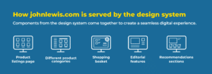
The John Lewis website consists of multiple web apps, which come together using a microservice architecture to provide a seamless web experience. There are separate web apps for the product listings page, different product categories, the shopping basket, editorial features, etc. Even within a webpage, specific areas of a page may be provided by a different web app, such as the recommendations sections.
Originally, the John Lewis website team had assembled a common library of components and design guidelines, available for use across the different apps. However, maintaining the library became onerous and time consuming. It also didn’t provide a consistent customer experience.
A design system is a set of resources that helps the organisation create consistent, accessible digital assets at scale.

A typical design system will include the following characteristics:
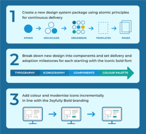
JL&P, with their suppliers, were developing an initiative to modernise the look and feel of the John Lewis website, moving from monochrome to colourful, creating a site with energy and personality to engage more customers for longer. There was a tight deadline of just a few months for this “Joyfully Bold” project, to tie in with a major brand relaunch that would reposition johnlewis.com as the site ‘For all of life’s moments’.
Changes had to be coordinated across the whole site to avoid disrupting the customer experience, and technical debt needed to be addressed to enable innovations that would support enhanced visual experiences.
Up until now, the design system had been very decentralised and many of its components had been adapted with variants to support individual product team needs. What was needed was a universal set of components that did the job and worked for everyone.
Creating a design system isn’t as simple as putting a group of designers together to formulate a plan. Design systems require detailed engineering work, governance, delivery, and investment strategies.
To maintain a consistent customer experience, we supported the partnership team to take an incremental approach using atomic design factors, starting with basic components as building blocks for more complex components.

At each stage, the team coordinated with designers, development teams and product owners, and ensured the support of senior management stakeholders to create a seamless transition.
With the website looking a lot happier, the partnership team now needed to understand where components were being used, who was using them, and what version of the design system they were on. The existing documentation website was difficult to maintain and dependent on developers. Other documentation was fragmented, making it difficult to find and access.
We needed to empower teams and make it easier for people to maintain the design system without relying on specialist language skills, so the team chose to implement a new documentation website that would:
As part of the work, the partnership team created an easy-to-understand contribution model that would help Partners quickly learn how to contribute to and maintain the design system themselves. This involved building a fundamental framework for components, adding auditing capabilities to help prioritise work, and test automation to speed up delivery.
The mixed consultant/partnership team has made big improvements to the design system they initially inherited. Improving the technology and automation, engaging the teams, and supporting the changes required for the Joyfully Bold initiative have all laid the foundations for an impressive design system that will allow John Lewis & Partners to consistently showcase their brand to customers faster and with reduced engineering effort.
Crucial to the success of the initiative is how the team worked. Design system designers constantly collaborate with product team designers to:
This work on digital channels within the John Lewis brand lays the groundwork for partnership brands Waitrose and John Lewis Financial Services to also adopt the Design System, making it a truly cross-business capability.
The engagement also confirms that design systems are essential to help organisations save time and money whilst improving customer experience, but they’re not a simple ‘one-size-fits-all’ fix. Designing a design system requires a comprehensive set of skills that transcend mere design skills; engineering work, governance, delivery and investment all form part of the solution when building a design system.
Find out more about Equal Experts design service.
Are you interested in this project? Or do you have one just like it? Get in touch. We’d love to tell you more about it.